The Typography Problem Affecting 780 Million Readers
Dyslexia affects between 5% and 17% of the global population, depending on the diagnostic criteria used and the language studied. The most widely cited figure across English-speaking countries is approximately 10%, which translates to roughly 780 million people worldwide navigating a digital world designed primarily by and for neurotypical readers.
The core challenge is not intelligence or motivation. Dyslexia is a neurological difference in how the brain processes written language. People with dyslexia commonly experience letter reversals (confusing b and d, p and q), letter migration (letters appearing to rearrange within words), visual crowding (adjacent letters blending together), and line skipping (losing track of which line they are reading). These effects are not uniform. They vary in intensity based on fatigue, stress, lighting conditions, and critically, the typography of the text being read.
The web’s default typography actively worsens these challenges. Most websites use fonts optimized for aesthetic appearance rather than cognitive accessibility. Thin strokes, uniform letter shapes, tight letter spacing, and small x-heights all increase the cognitive load for dyslexic readers. The good news is that font choice, spacing, and layout can be modified at the browser level, and the research supports specific approaches that make measurable differences.
What Research Says About Dyslexia-Friendly Fonts
OpenDyslexic: The Most Studied Option
OpenDyslexic, created by Abelardo Gonzalez in 2011, is an open-source typeface designed specifically for dyslexic readers. Its defining feature is weighted bottoms on each letter. The bottom portion of characters is heavier than the top, theoretically anchoring letters to the baseline and reducing the perception of rotation or flipping.
Research results on OpenDyslexic are mixed but instructive. A 2013 study at the University of Twente found that while participants did not read faster with OpenDyslexic, they reported reduced perceived difficulty and increased confidence. A 2016 study published in the Annals of Dyslexia found no statistically significant improvement in reading speed or accuracy with OpenDyslexic compared to Arial, but noted that subjective preference was strongly in favor of OpenDyslexic among dyslexic participants.
The key insight from the research is that subjective comfort matters. Reading is not purely a speed exercise. A font that reduces anxiety and increases willingness to engage with text produces benefits that reading speed metrics alone do not capture. If someone reads for 30 minutes with OpenDyslexic instead of giving up after 10 minutes with a standard font, the practical outcome is dramatically better.
Atkinson Hyperlegible: Designed for Differentiation
The Braille Institute released Atkinson Hyperlegible in 2020, designed with a different philosophy. Rather than weighting letters, it maximizes the visual distinction between similar characters. The lowercase L, uppercase I, and number 1 each have unique visual identifiers. The letters b, d, p, and q have exaggerated shape differences at their terminals. Letter openings (the gaps in letters like c, e, and a) are widened to prevent them from blurring into closed shapes.
Atkinson Hyperlegible was not designed exclusively for dyslexia but for low vision and general legibility. However, its emphasis on character differentiation addresses one of the primary challenges dyslexic readers face: distinguishing between similar-looking letters. It is also aesthetically closer to conventional sans-serif fonts, making it less visually conspicuous than OpenDyslexic.
Lexie Readable and Other Options
Lexie Readable (originally known as Lexia Readable) was designed by Keith Bates as a teaching font for children with reading difficulties. It combines the readability principles of Comic Sans (one of the few widely available fonts where b and d have genuinely different shapes) with a more professional appearance. It performs well in informal readability testing but has less formal research behind it than OpenDyslexic or Atkinson Hyperlegible.
Comic Sans itself, despite being the subject of design-world derision, has characteristics that many dyslexic readers find helpful: irregular letter shapes, clear character differentiation, and generous spacing. A 2011 report from the British Dyslexia Association included Comic Sans in its list of recommended fonts.
Beyond Fonts: The Full Readability Stack
Font choice is one layer of a multi-factor readability system. Research consistently shows that these additional factors have equal or greater impact:
Letter Spacing
A 2012 study published in the Proceedings of the National Academy of Sciences found that increasing letter spacing by 2.5 standard deviations improved reading accuracy in dyslexic children by an average of 20% and increased reading speed by 14%. This was a larger effect than any font swap alone. The researchers attributed this to reduced visual crowding, the phenomenon where adjacent letters interfere with each other’s identification in the visual system.
Line Spacing
Line spacing (leading) of 1.5 to 2.0 times the font size significantly reduces line skipping, one of the most disruptive symptoms for dyslexic readers. The default line spacing on most websites is between 1.2 and 1.5, which is adequate for neurotypical readers but insufficient for many dyslexic readers.
Line Length
Optimal line length for readability is between 50 and 75 characters per line. Many websites, especially on large desktop monitors, allow text to span 100+ characters across the full viewport width. This makes it difficult for any reader to track from the end of one line to the beginning of the next, and the problem is amplified for dyslexic readers. Constraining line width to a readable column is a significant improvement.
Background Color
Pure white backgrounds (#FFFFFF) create high contrast that can cause visual stress. A cream or light pastel background reduces this glare without sacrificing readability. The British Dyslexia Association recommends backgrounds of cream, soft yellow, or light blue. Individual preferences vary widely, and the ideal solution lets users choose their own background color.
Method 1: Safari Reader Mode
Safari’s built-in Reader Mode is the zero-installation starting point for improving web text readability.
- Navigate to an article or text-heavy page in Safari.
- Tap the Reader Mode icon (lines icon) in the address bar, or on macOS, click it or press Command + Shift + R.
- Once in Reader Mode, tap the Text Settings button (AA icon).
- Adjust font size, font choice, and background color.
Reader Mode strips away all page design and presents the text in a clean, customizable format. On iOS, you can choose from a limited set of fonts and set the background to white, sepia, gray, or black. On macOS, the options are similar.
Limitations: Reader Mode only activates on pages Safari identifies as articles. It does not work on web applications, forums, e-commerce product pages, search results, or any page without a clear article structure. It also removes all navigation, imagery context, and interactive elements. It is a reading tool, not a browsing tool.
Method 2: Using a Dedicated Dyslexia Font Extension
A purpose-built extension applies dyslexia-friendly typography to every web page while preserving the page’s layout, images, navigation, and functionality. This is the approach that works across all types of web content, not just articles.
Dyslexia Font for Safari replaces the fonts on any web page with OpenDyslexic while maintaining the page’s visual structure. Headings remain headings, paragraphs remain paragraphs, and the page’s layout stays intact. The font substitution happens at the CSS level, overriding the site’s specified font family with OpenDyslexic.
Setting Up on iPhone and iPad
- Install the extension from the App Store.
- Go to Settings > Apps > Safari > Extensions and toggle it on.
- Grant website access permissions. “All Websites” provides automatic font replacement everywhere. “Ask” mode lets you activate it selectively.
- Visit any web page. Text content renders in OpenDyslexic automatically.
Setting Up on Mac
- Install from the Mac App Store.
- Open Safari > Settings > Extensions and enable the extension.
- Configure website access in the same panel.
- The extension activates immediately on supported pages.
Fine-Tuning the Experience
Font replacement alone is a starting point. For the best results, combine it with spacing and layout adjustments.
Method 3: Combining Multiple Accessibility Extensions
The most effective setup for dyslexic readers stacks multiple tools, each addressing a different aspect of readability.
Font + Spacing + Layout
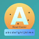
Start with a dyslexia font extension for character-level readability. Then add Read Easier for layout-level improvements. Read Easier can adjust line spacing, constrain line width, modify text alignment, and change background colors. These layout modifications address the spacing and contrast factors that research identifies as equally important to font choice.
For readers who also need larger text, either due to presbyopia or personal preference, Presbyopia adds text enlargement controls. This is particularly useful on mobile devices where default font sizes can be as small as 14px, which is below the 16px minimum recommended by WCAG 2.1 for body text.
Recommended Configuration Stack
- Dyslexia-friendly font (via extension): OpenDyslexic or Atkinson Hyperlegible.
- Letter spacing: Increase by 1-3 pixels beyond default. Even small increases reduce visual crowding.
- Line spacing: Set to 1.8x or 2.0x the font size.
- Line width: Constrain to 65-75 characters per line.
- Background: Cream (#FDF5E6) or light blue (#E6F3FF) instead of pure white.
- Font size: Minimum 18px for body text on desktop, 16px on mobile.
This combination addresses font recognition (character differentiation), visual crowding (letter spacing), line tracking (line spacing and width), visual stress (background color), and basic legibility (font size). Each factor contributes to the total reading experience.
Method 4: System-Level Accessibility Settings
Both iOS and macOS include accessibility features that complement browser-level adjustments.
iOS Settings
- Settings > Accessibility > Display & Text Size > Larger Text: Increases system-wide text size, which Safari respects for default-sized text.
- Settings > Accessibility > Display & Text Size > Bold Text: Increases font weight across the system, improving letter definition.
- Settings > Accessibility > Display & Text Size > Increase Contrast: Enhances contrast ratios between text and backgrounds.
- Settings > Accessibility > Motion > Reduce Motion: Stops animations and parallax effects that can be distracting.
macOS Settings
- System Settings > Accessibility > Display > Text Size: Adjusts system text sizing.
- System Settings > Accessibility > Display > Increase Contrast: Boosts contrast ratios.
- Safari > Settings > Advanced > Accessibility: Enable “Never use font sizes smaller than” and set a minimum (14px or 16px is recommended).
These system-level settings work alongside browser extensions. The system handles UI elements and default sizing, while extensions handle web page content.
Building Your Personal Readability Profile
Dyslexia manifests differently for every individual. Some people primarily experience letter reversal, making character differentiation (and therefore font choice) the highest-impact factor. Others primarily experience line skipping, making line spacing and background color more important. There is no universal “best” configuration.
Step 1: Identify Your Primary Challenge
Spend a focused 15-minute reading session on a text-heavy web page. Pay attention to:
- Do specific letters cause confusion? (Font is the priority)
- Do you lose your place between lines? (Line spacing and background color are priorities)
- Do words blur together? (Letter spacing is the priority)
- Does the text feel too small? (Font size is the priority)
- Does the white background cause strain? (Background color is the priority)
Step 2: Apply Changes Incrementally
Start with the factor that addresses your primary challenge. Use it for three to five days before adding the next adjustment. This lets you isolate which changes are actually helping rather than applying everything at once and not knowing what made the difference.
Step 3: Test Across Different Content Types
A configuration that works well for reading news articles might not work as well for scanning data tables or navigating web applications. Test your setup across the range of websites you use daily. You may want different configurations for different contexts, which per-site extension settings can accommodate.
Step 4: Revisit Periodically
Reading needs change with fatigue levels, medication, screen time habits, and even seasonal light conditions. A configuration that worked well in winter (when you are reading mostly in artificial light) might need adjustment in summer (when ambient light is brighter and more variable). Check in with your settings every few months and adjust as needed.
What Schools and Workplaces Should Know
For educators and employers supporting dyslexic individuals, the key takeaway is that accommodation is not just about providing extra time. Digital reading accommodation means ensuring that the tools for font customization, spacing adjustment, and layout modification are available and normalized.
Browser extensions are the most practical accommodation for web-based work because they require no IT infrastructure changes, work on personal and shared devices, respect individual preferences, and leave no visible marker that singles anyone out. A student or employee can activate their preferred reading configuration in Safari’s extension settings and browse the web with their optimized typography while everyone else sees the default. This is accommodation that is both effective and invisible, exactly as it should be.
The research is clear: small typographic adjustments produce meaningful improvements in reading comfort, engagement, and endurance for dyslexic readers. The tools to make these adjustments exist and are straightforward to set up. The only variable is awareness that they are available and the willingness to invest 10 minutes in configuration. For the roughly one in ten people who stand to benefit, that is 10 minutes that changes every subsequent reading experience on the web.